The first candidates have declared, and that means Rand Paul, Hillary Clinton, Ted Cruz and Marco Rubio all have shiny new logos to go with their new campaigns.
This early in the campaign, with little actual substance to pick apart so far, the logos become prime bait on the Internet, attracting supporters, haters, wanna-be graphic designers and more.
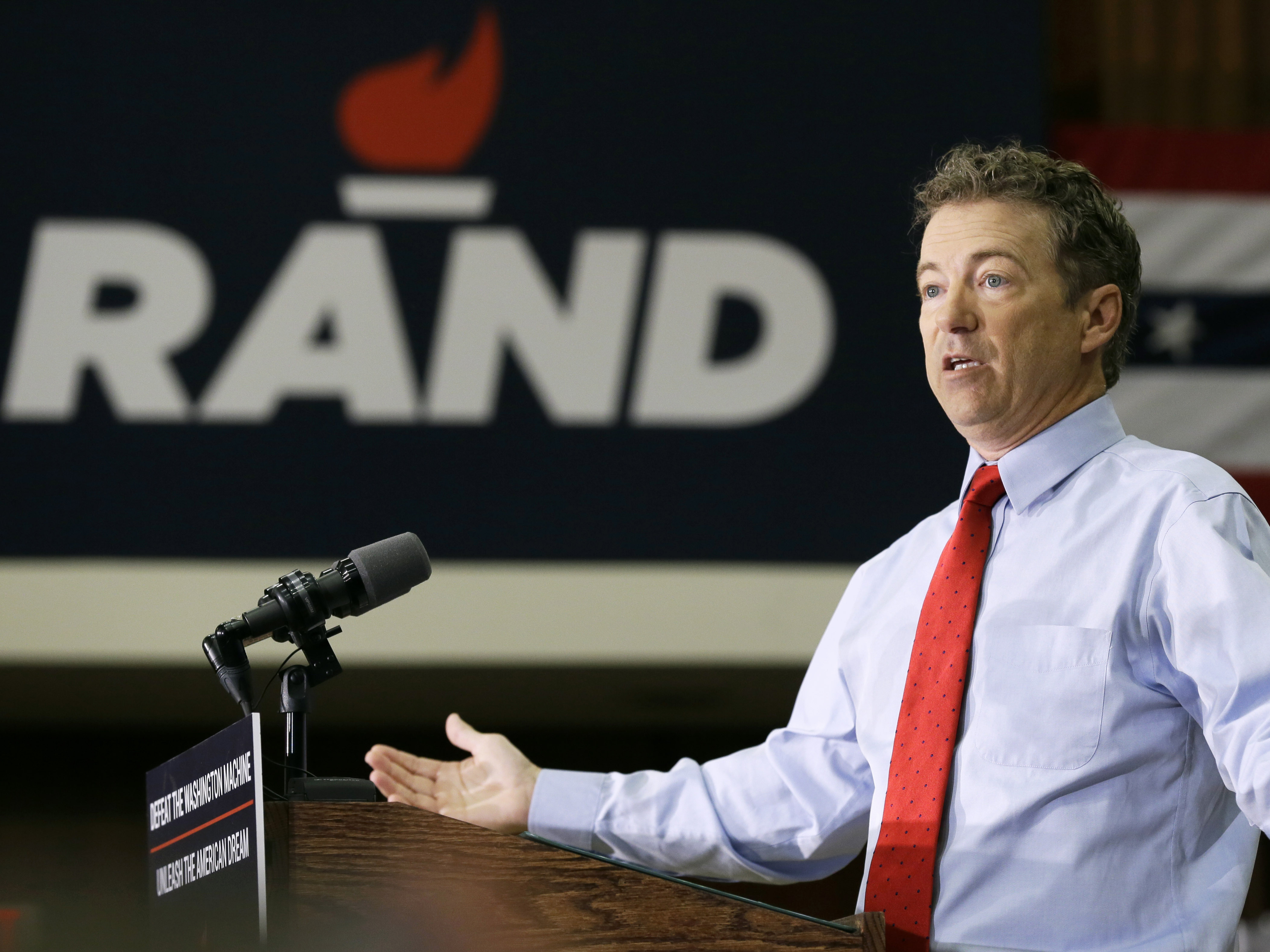
Let’s start with Rand Paul, whose logo features “Rand” under a graphic of a flame. The graphic has been showing up at events with him, along with the slogan “Defeat the Washington Machine, Unleash the American Dream.”
Armin Vit, a graphic designer who runs “Brand New,” a blog about logos, isn’t exactly a fan. While the letters look strong and assertive, “the torch itself — the fire part seemed like it could have used a couple more revisions to make it more convincing,” he told NPR’s All Things Considered. “It lacks a little bit of … fire.”
The flame graphic is also being used in Paul’s “Liberty Not Hillary” bumper stickers and other merchandise. A silhouette of Rand (remember that that Obama “Hope” artwork?) has also made a cameo on some of the campaign’s swag.

(Photo courtesy HillaryClinton.com)
Meanwhile Hillary Clinton’s logo, barely four days old, has already faced a bipartisan beating online. The New Yorker published a cartoon of a two people looking at her logo with the caption “I’m just not sure a big red arrow pointing to the right is the best logo for a Democratic candidate, is all.”
More than 1 million people viewed a 5-minute redesign posted on the website imgur.
Rick Wolff, a graphic designer, created a font out of the logo, which he called “Hillary Bold” and “Hillvetica.”
The Washington Post created a tool to allow its readers to create their own slogan using Wolff’s font.
And, in a full-circle moment, Clinton’s team used Wolff’s font to promote volunteering on the campaign.
Despite the mockery, designer Vit said Clinton’s logo “definitely stands out as something we haven’t seen in in presidential campaign logos.”
(Photo courtesy TedCruz.org)
Texas Sen. Ted Cruz’s logo looks similar to Paul’s, invoking a flame to go with his slogan “Courageous Conservatives: Reigniting the Promise of America.”
Vit, though, was unimpressed, telling All Things Considered, “This flame kind of makes me think of oil burning somehow.”
But his announcement speech at Liberty University was curiously logo-less, and his campaign has been slow to use the logo on campaign merchandise.
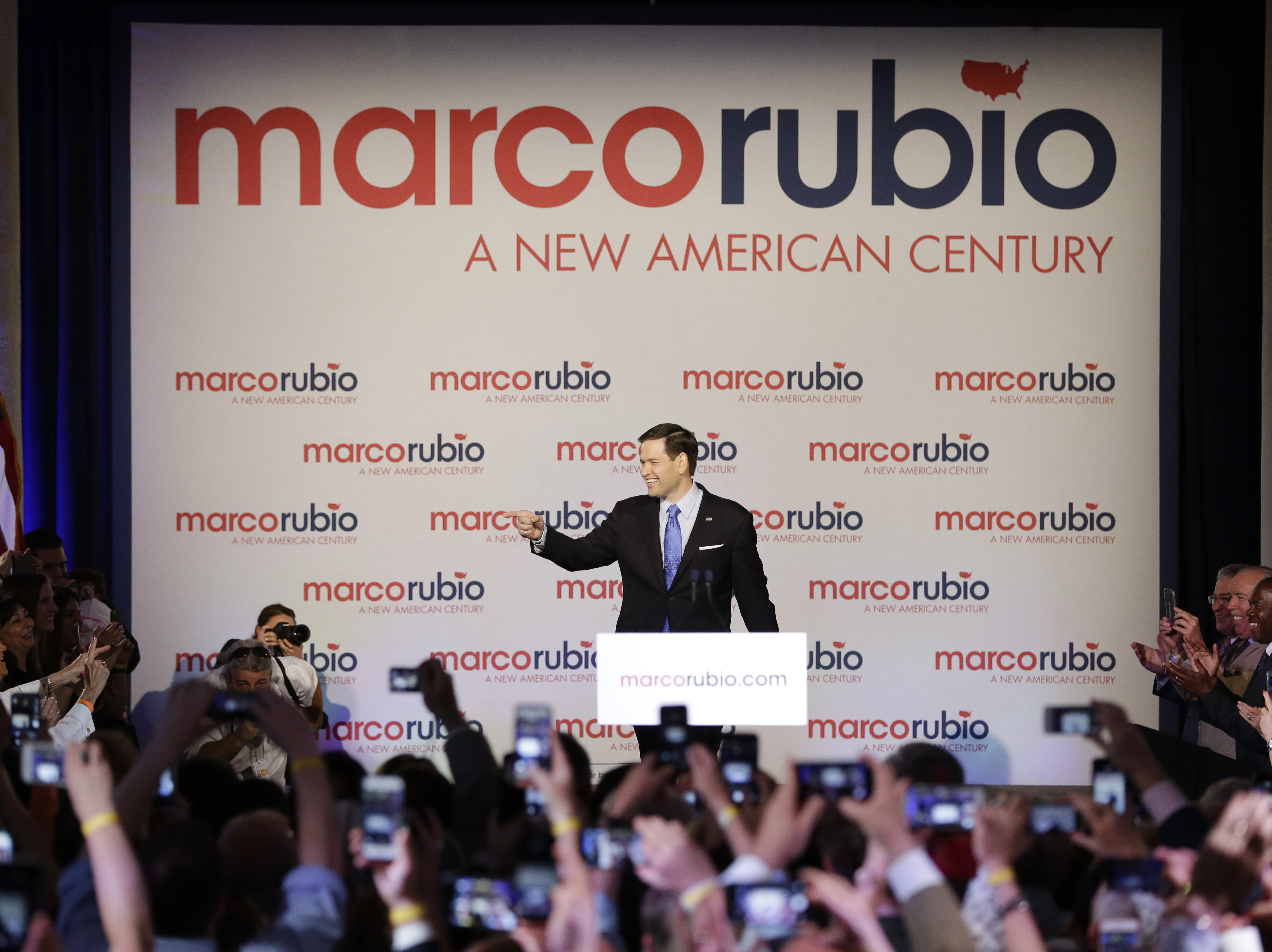
Sen. Marco Rubio, the latest to announce, went for a more simple logo — his name spelled out lowercase with a tiny graphic of the country to dot the “i.” But his campaign was not shy about repetition — it was splashed all over the backdrop of his announcement speech Monday:
But all in all, Vit said, the good, the bad and the ugly on the whole are not so bad. The logos “have a level of sophistication we haven’t seen in a really long time,” he said.
9(MDEwMjQ0ODM1MDEzNDk4MTEzNjU3NTRhYg004))
